Branding & Packaging | Urban Identity for Sports Supplements
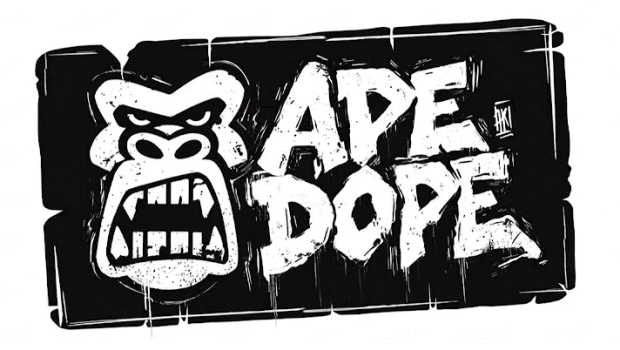
APE DOPE is a comprehensive visual identity and packaging design project developed for a disruptive sports supplement brand. The challenge was to create a brand that broke with the category's aesthetic standards, connecting with a young, urban audience that sees fitness not just as a sport, but as a lifestyle.
The Concept: Urban Force
The core concept revolves around the duality of the “inner beast” and streetwear culture.
“APE” (Ape): Represents primal strength, raw power, and the animal instinct unleashed during training. It’s the symbol of “beast mode.”
“DOPE” (Cool/Powerful): Provides a connection to urban culture, street art, and a rebellious yet confident attitude.
We created a brand that feels equally at home in the gym and on the street, fusing the world of bodybuilding with the aesthetics of graffiti and skateboarding.


The Gorilla: The gorilla isn't just a decorative element; it's the brand ambassador.
Through a series of visual compositions, the gorilla embodies the APE DOPE attitude. It’s shown in its natural habitat (the gym), interacting with the products, and representing the pinnacle of strength.

Vibrant Color System:
To differentiate the product line (Pre-Workout, Post-Workout, EAA), we implemented a high-contrast fluorescent color system (Red, Blue, Green) and a metallic bronze tone. These colors “pop” against the black background, guaranteeing maximum visibility on the shelf and on social media.


